← All case studiesArchv / Selected work
Branding · Visual identity
Artarea
A flexible visual identity built from bold contrast, energetic orange, and adaptable marks.
01 / The project
The project
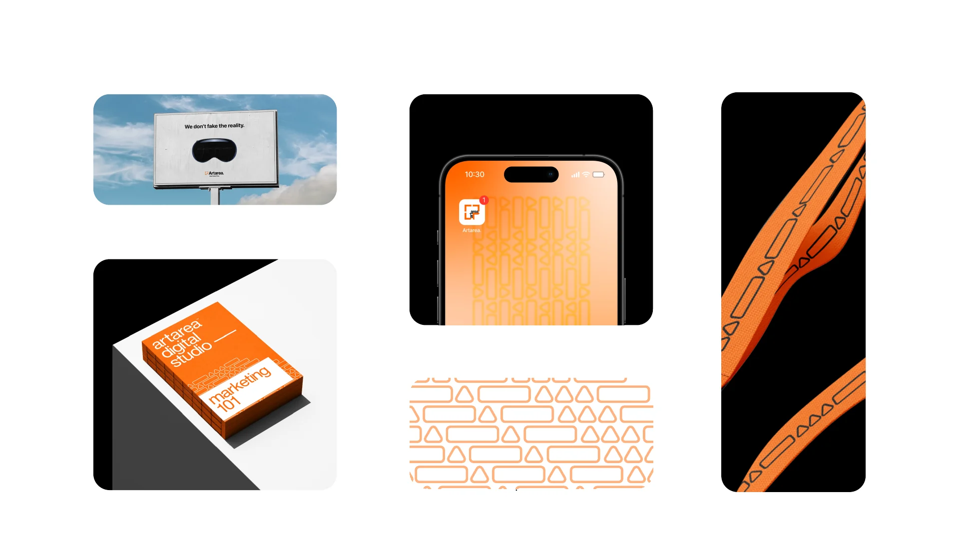
The Artarea brand guidelines present an identity system designed to work across print pieces, access credentials, digital formats, and merchandise.
02 / Design decisions
The approach
01
Flexible signatures
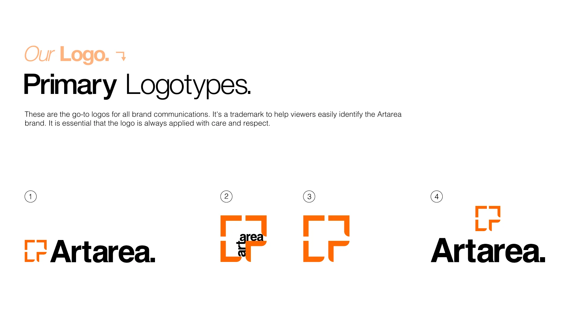
Primary and alternate logo lockups give the identity options for different placements and scales.
02
A clear visual language
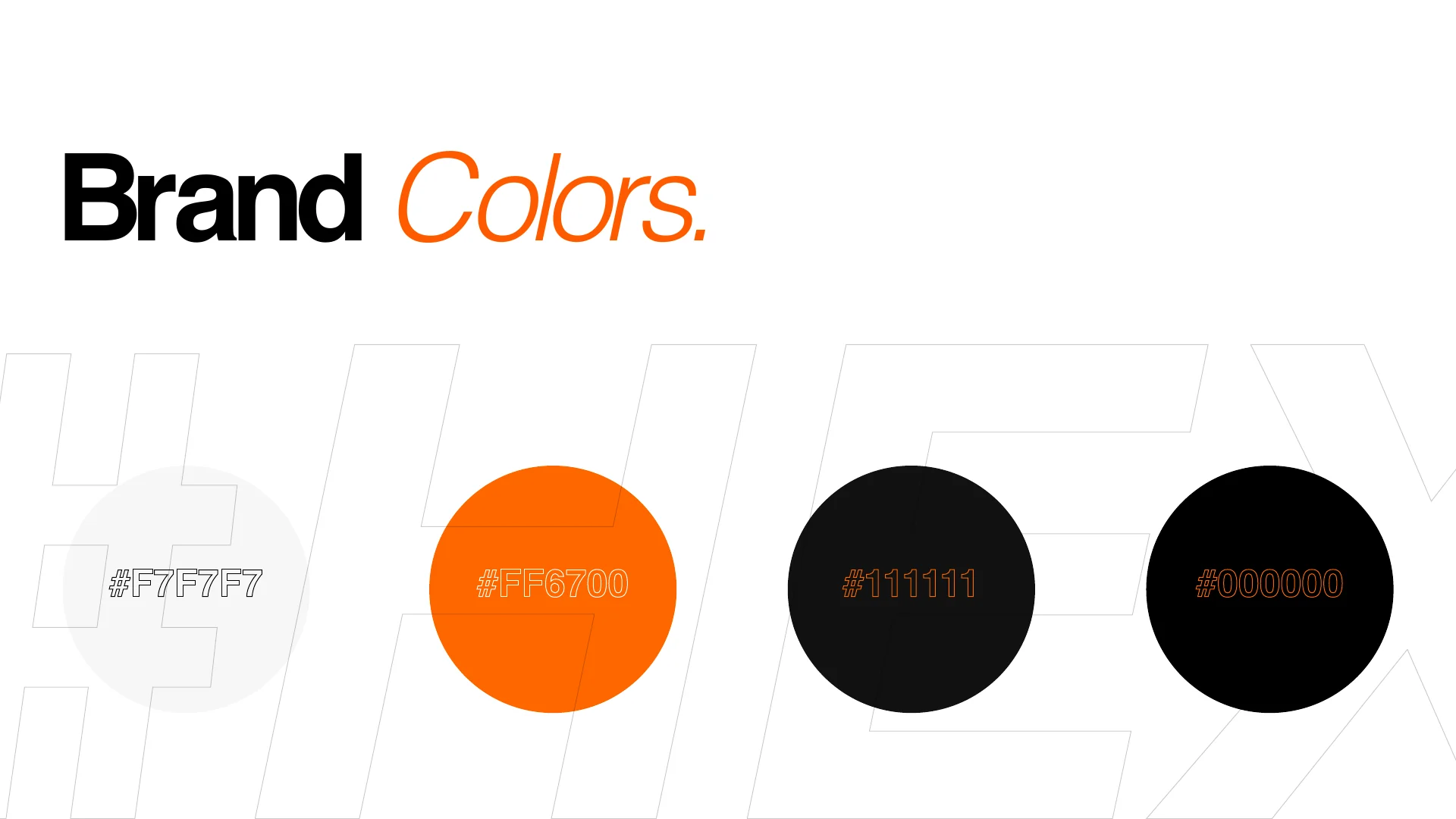
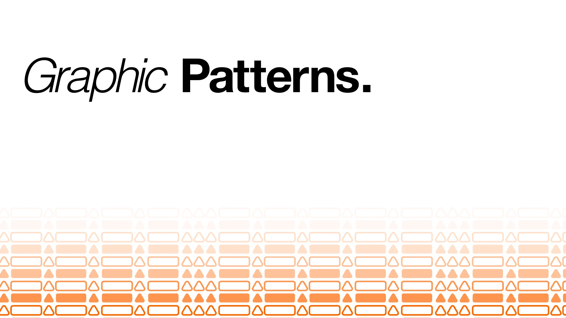
Orange, black, and off-white create contrast; Helvetica and a repeating graphic pattern carry the system across layouts.
03
Consistent applications
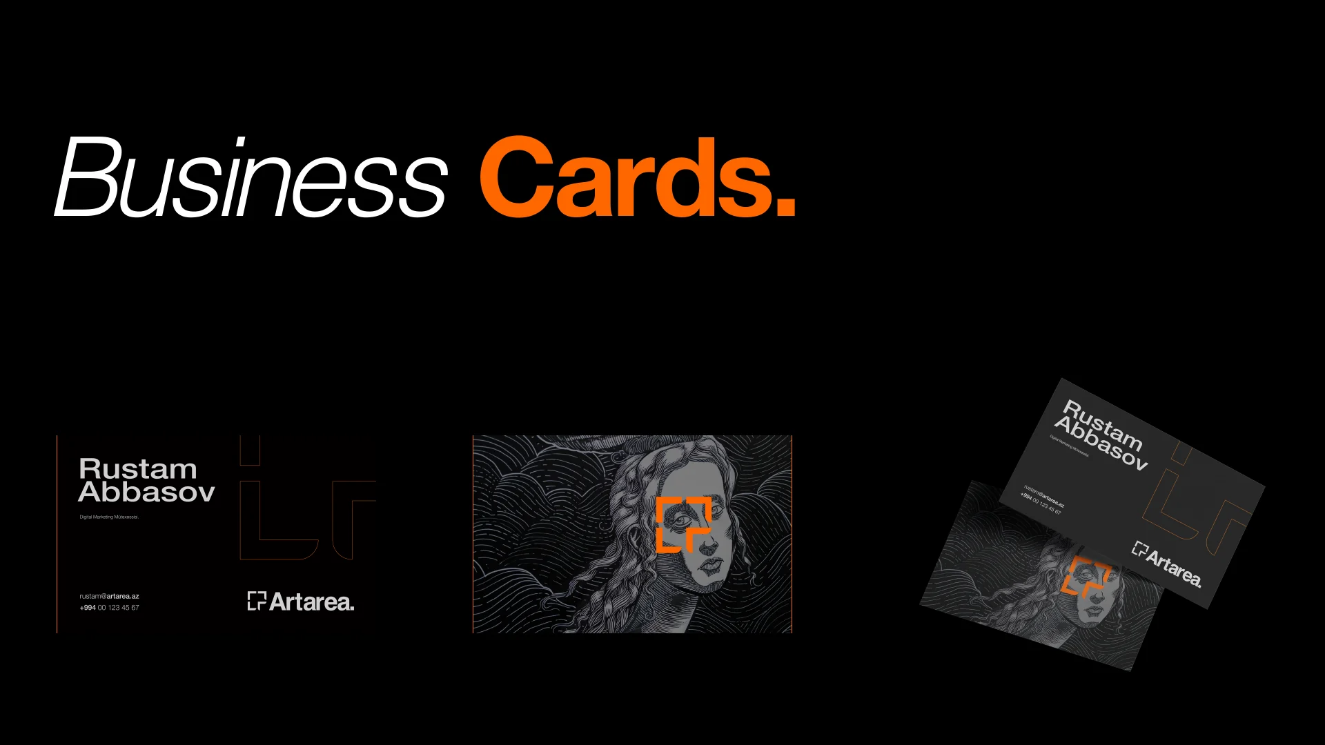
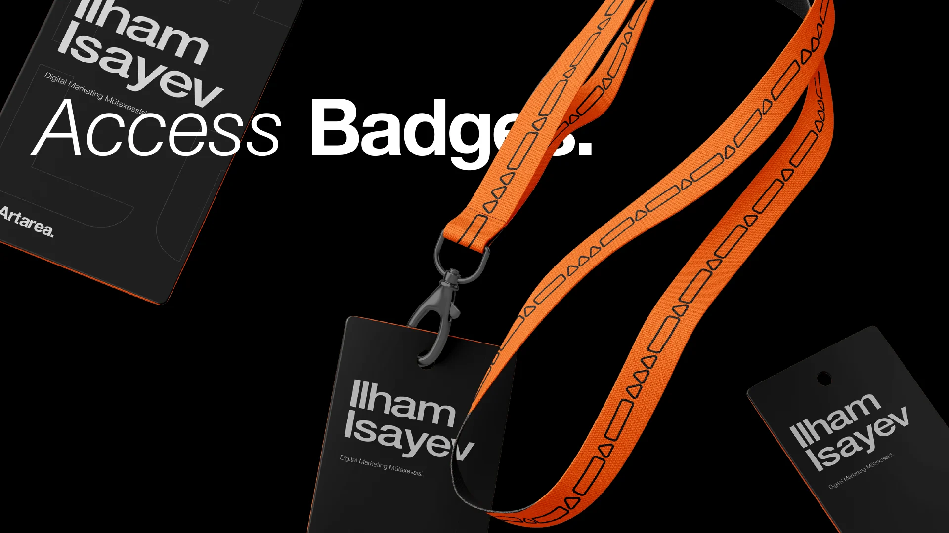
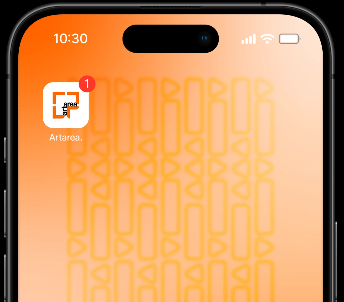
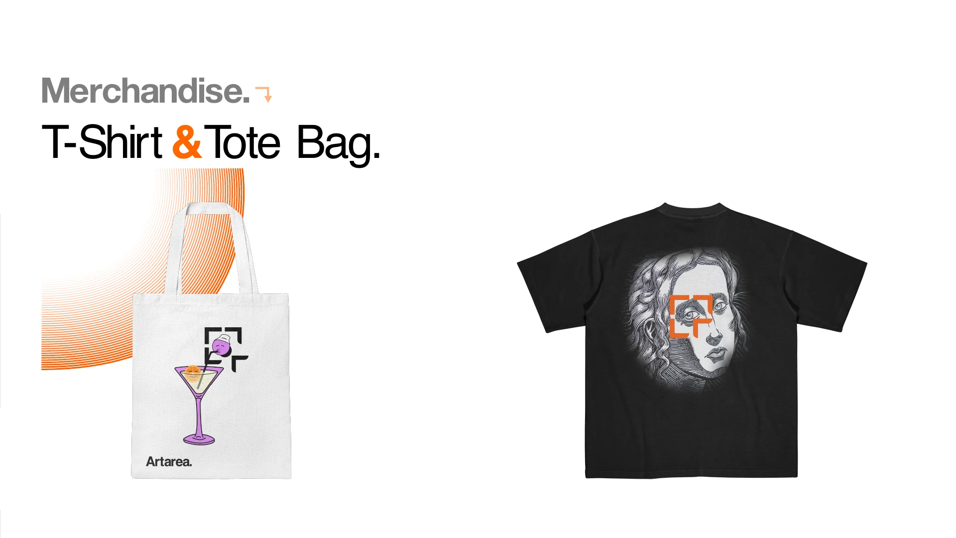
The guidelines demonstrate the identity on business cards, badges, digital formats, and merchandise.
03 / Scope
What we made
- Visual identity
- Logo system
- Graphic pattern
- Brand guidelines
- Application concepts